Week 17 (February 20th - 26th)At this point, we were visiting sticker printing places and realised they required certain formats and guidelines. I started formatting based on those requirements as a continued to work out the kinks in my designs. The guidelines given by the printer shops caused a bit of a challenge in designing the stickers. Some of the designs I created were either impractical to produce or were too expensive for mass production. Finalising the stickers had to take into account all these restrictions, but at the same time not compromise the integrity of the work. The pink lines shown in the first two designs are solely guidelines for the printing shop and is not part of the design. I tried both circle and square sticker formats to see how they would look. 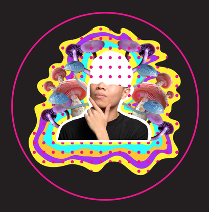 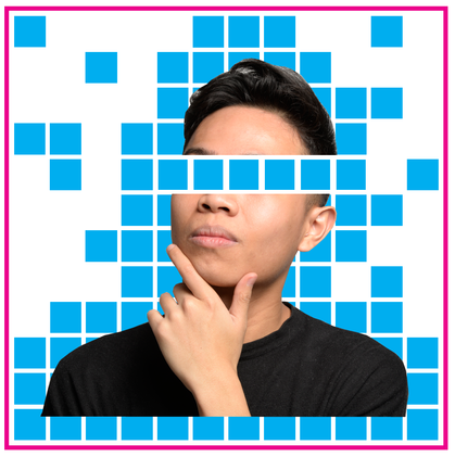 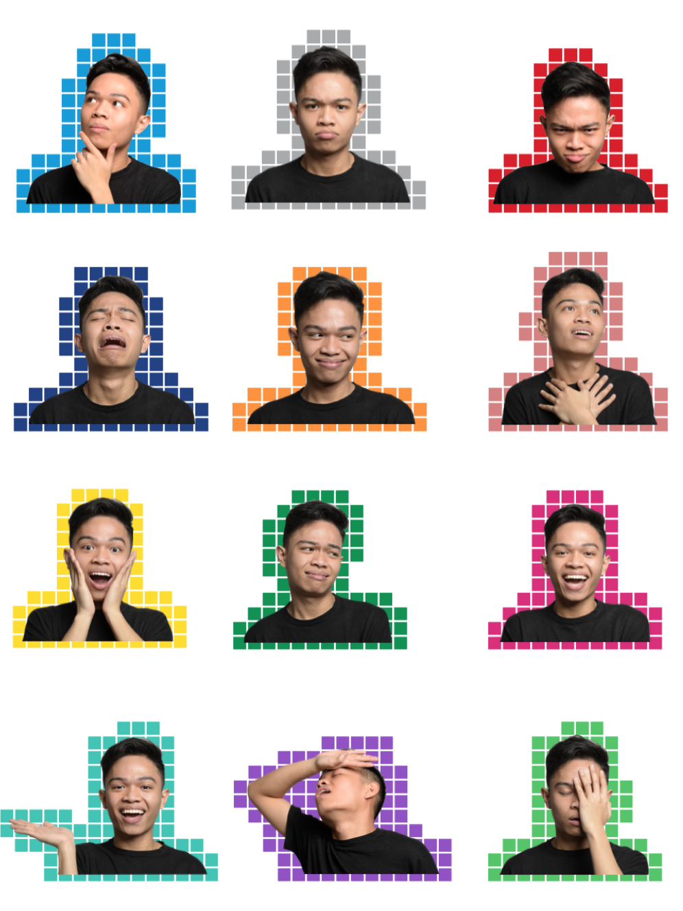 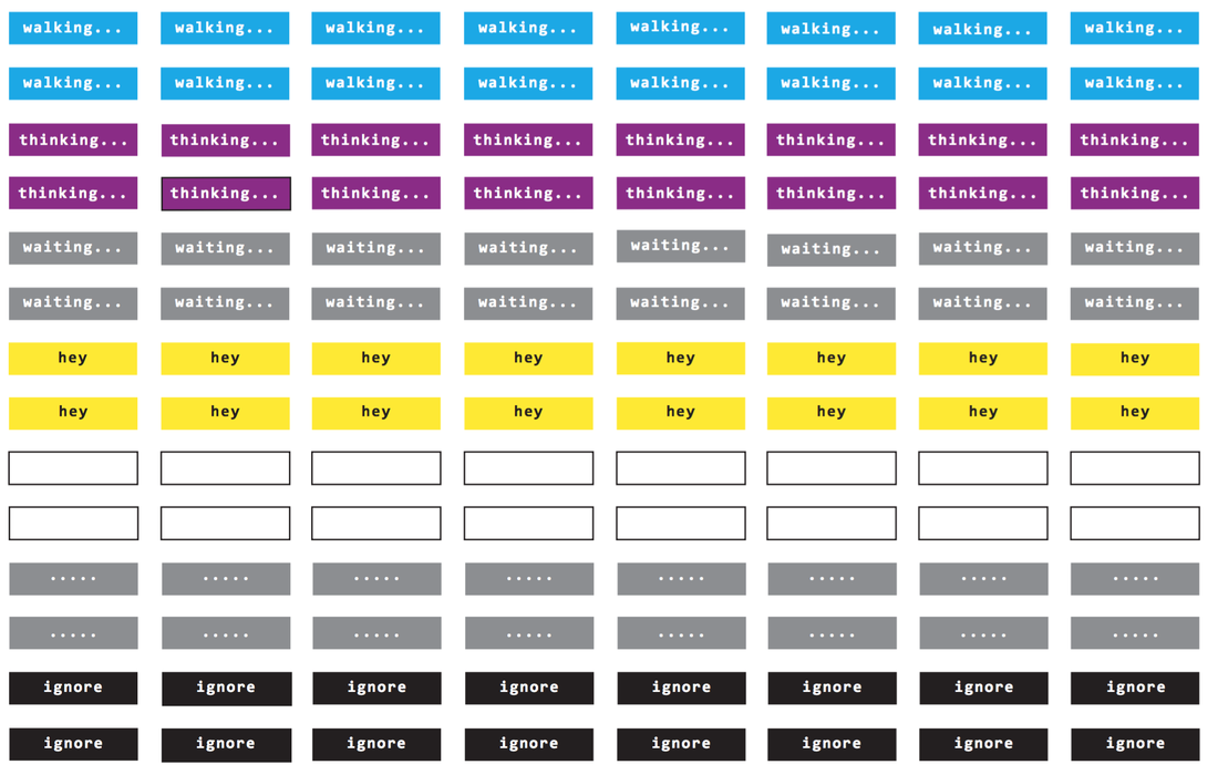 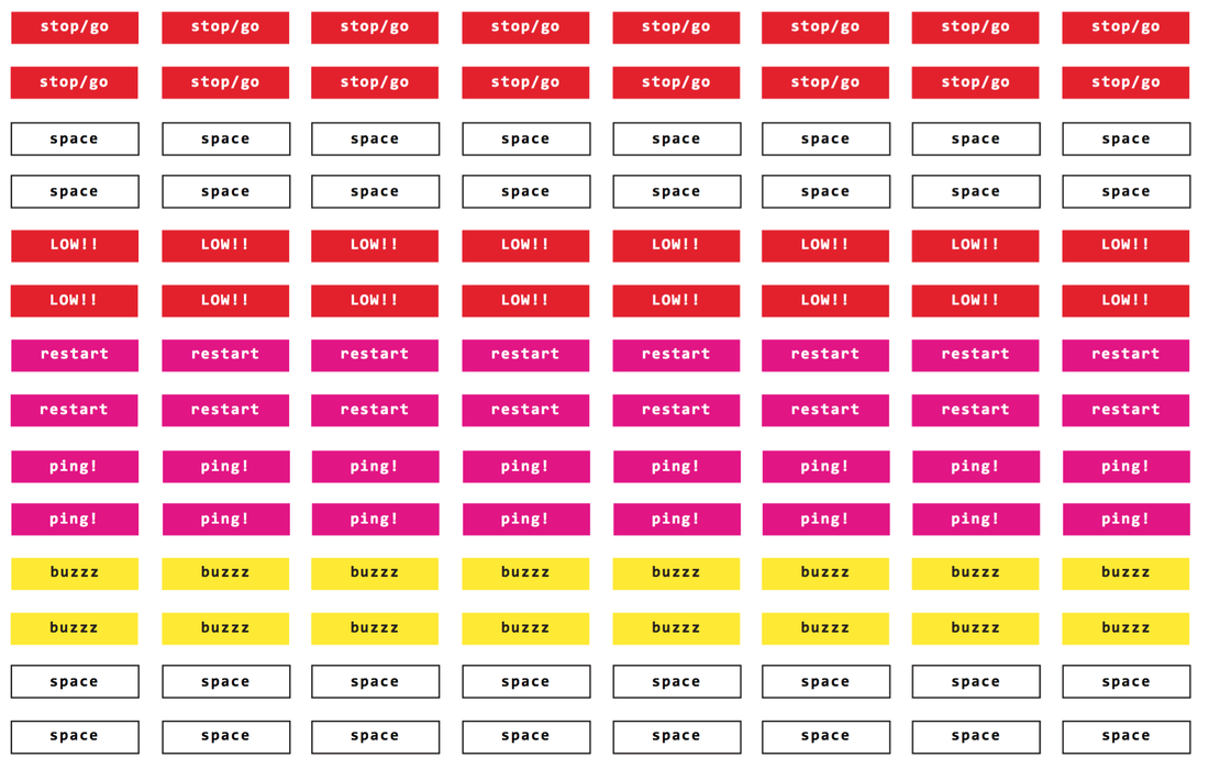
0 Comments
Week 17 (February 20th - 26th)I continued with creating a variation of texts and formats. I started becoming even more selective as I created more stickers. They became more simplistic but it still held a sense of playfulness and boldness. 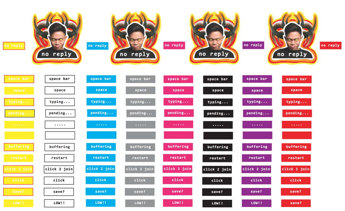 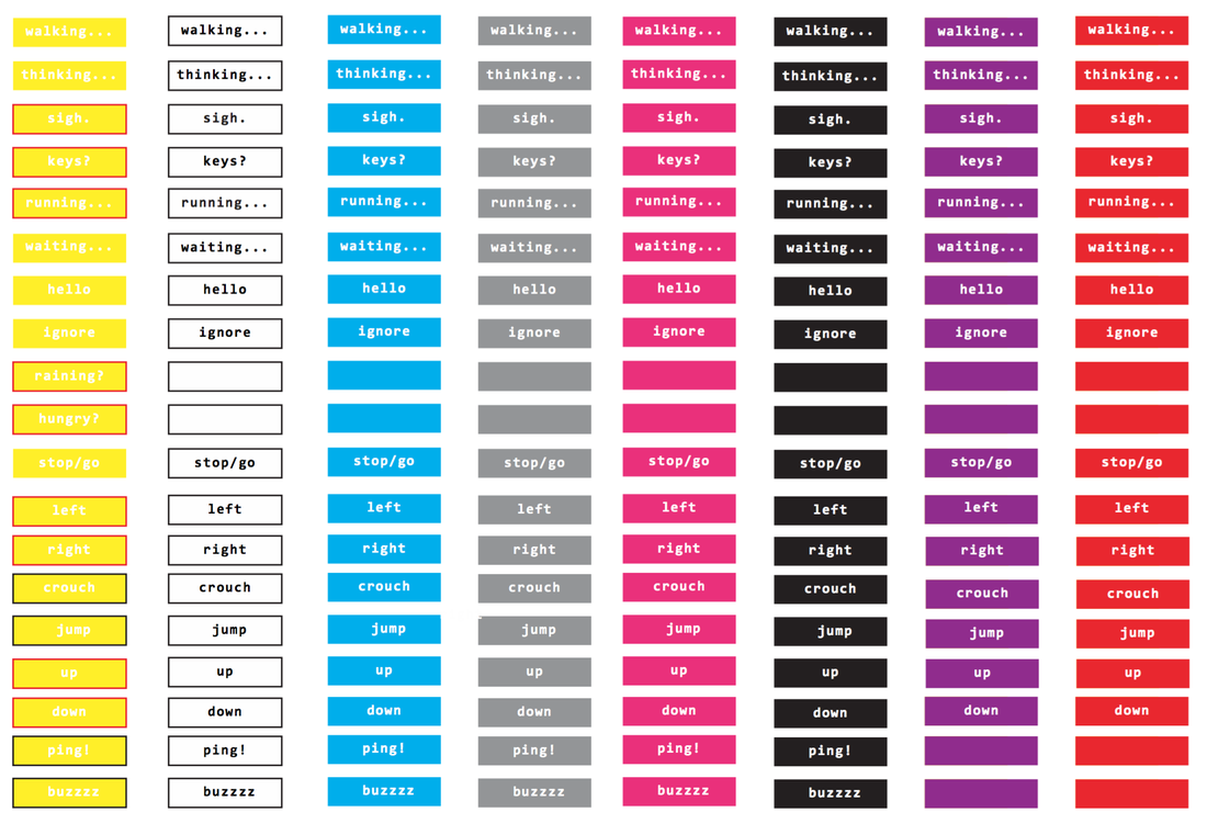 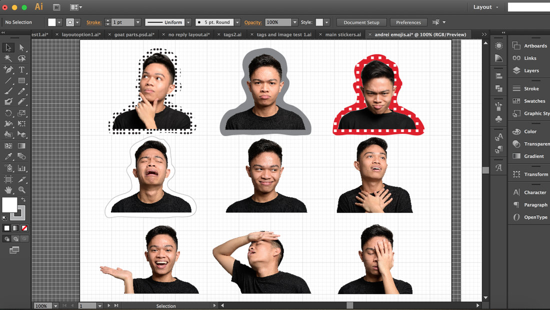 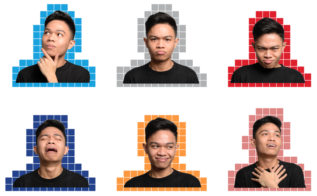 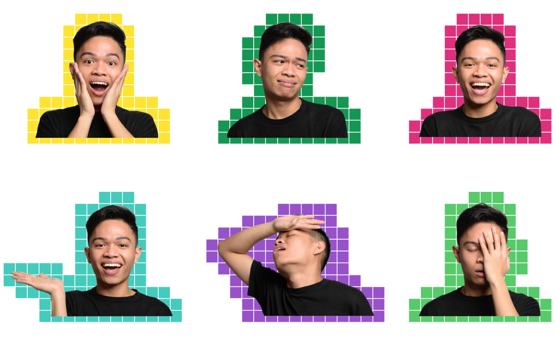 Week 16 (February 13th - 19th)I continued to create more stickers, my interests started to shift towards the text and repetition. I was thinking more about composition and combinations of smaller simpler designs, rather than singular and busy designs. 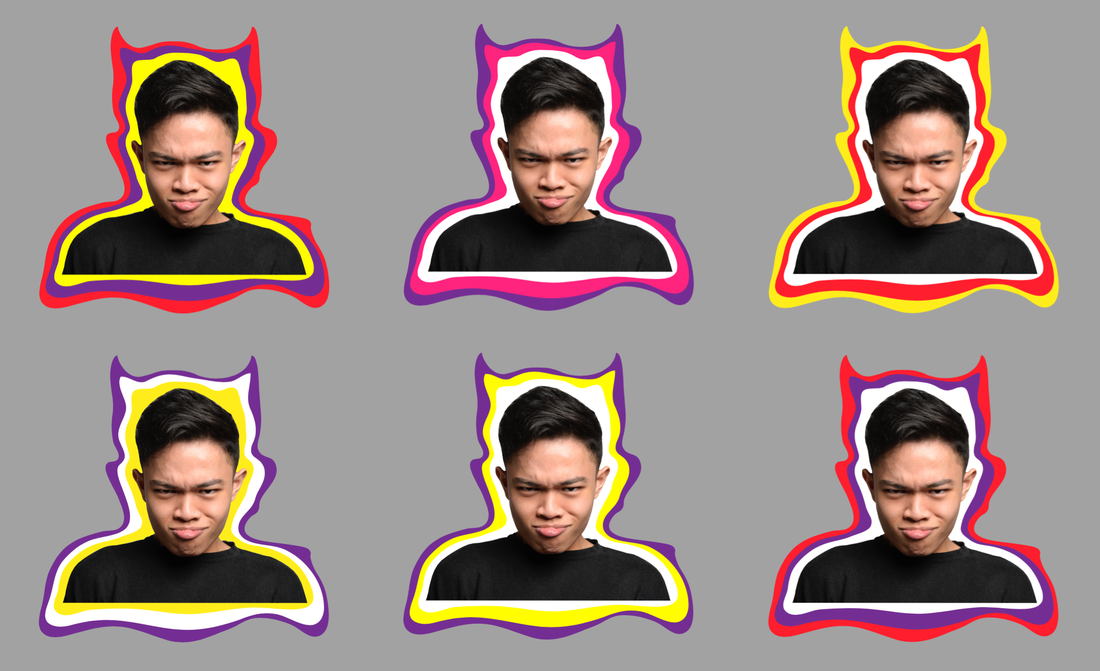 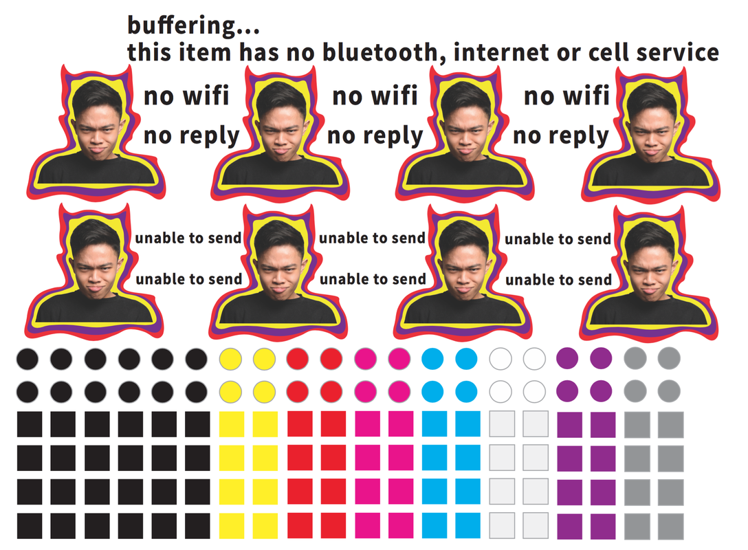 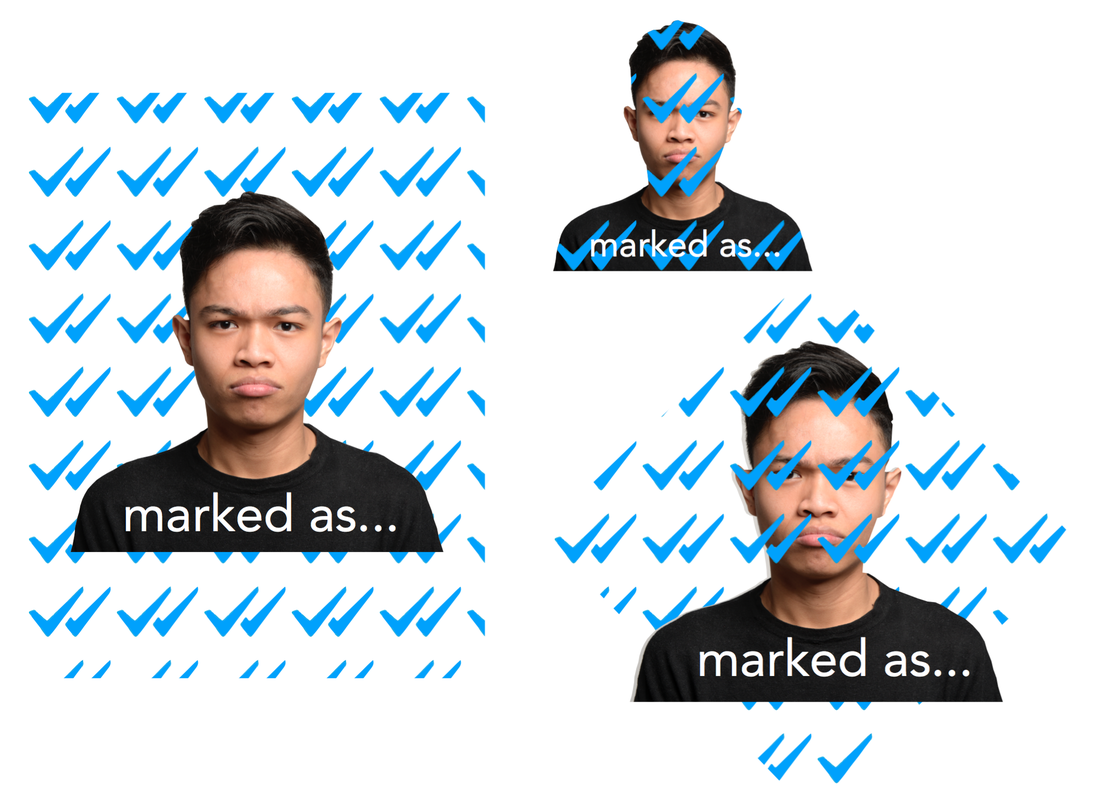 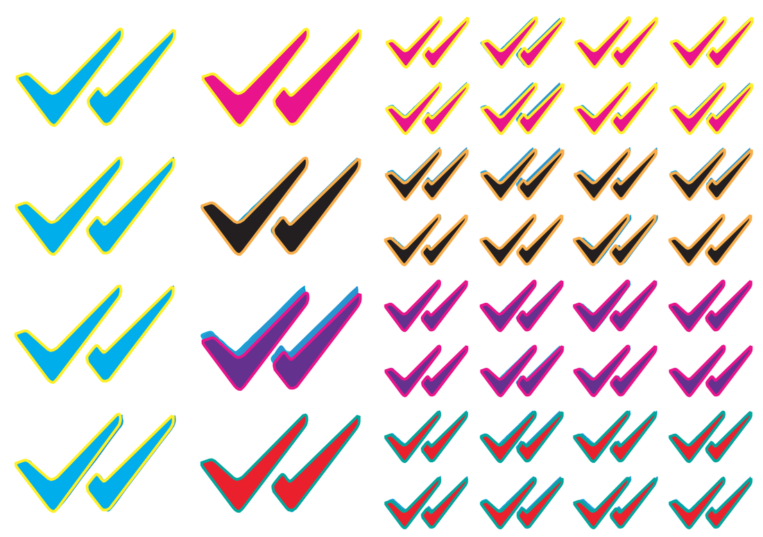 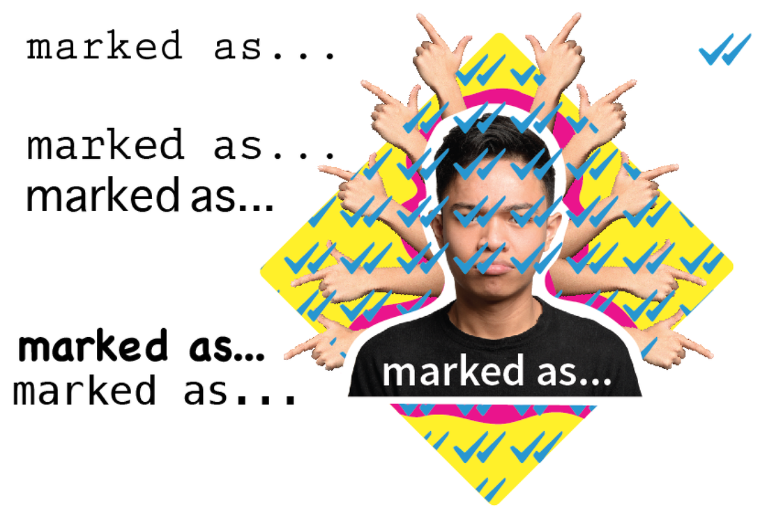 Week 16 (February 13th - 19th)We all created our own sticker designs using the photographs we took in the studio. This is what I initially came up with.  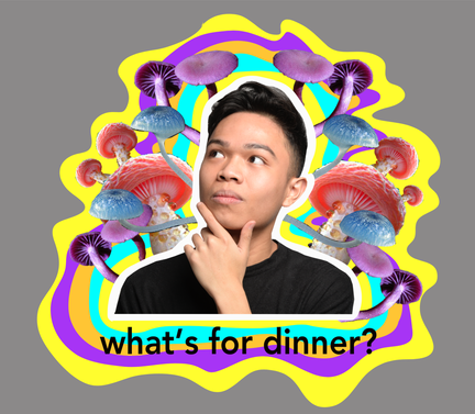 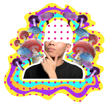 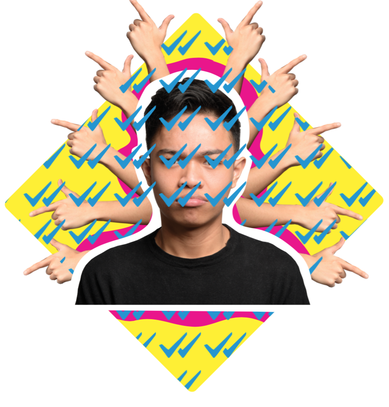 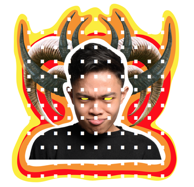 I played around on Adobe Photoshop and Illustrator and came up with different/tweaked versions of the same image. 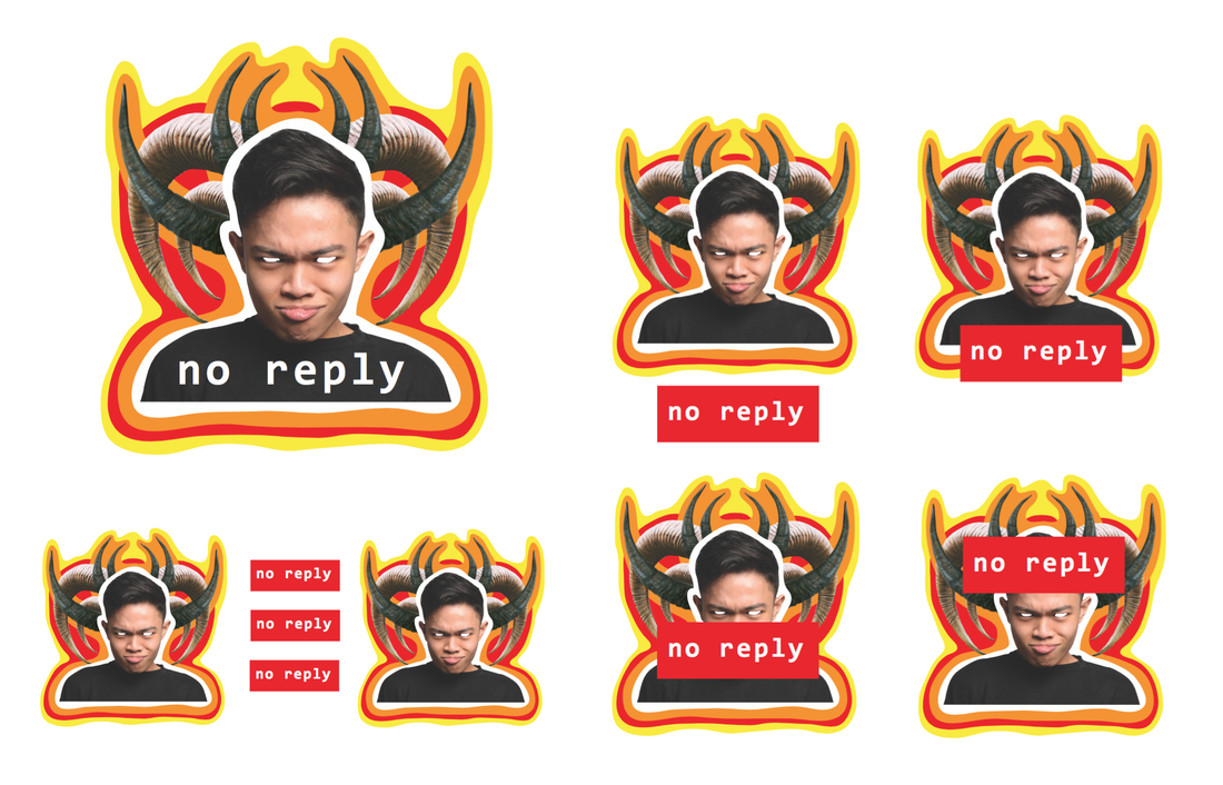 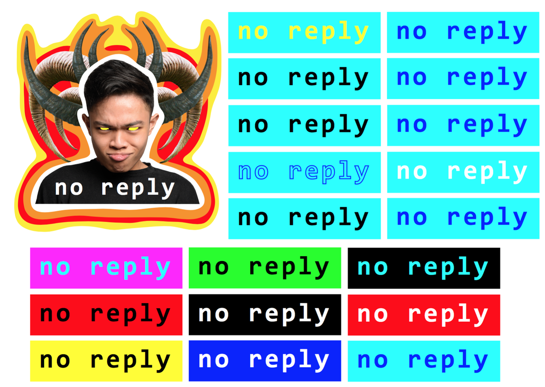 Unlike my illustration series, these designs are popping with neon colours like red, blue, yellow and green. I attempted to create loud and busy aesthetics to create something fun, playful and psychedelic. I made Andrei the centre of the image and included images I found on the internet. Symmetry, repetition (copies) and pairings with text are still evident in this practice. It is aesthetically very different from the collages we did as a group, but connections can still be made between them.
Week 16 (February 13th - 19th)The exercises we had done so far were all using found material in some way. We thought it would be interesting to make out own material by taking photographs of ourselves and see if that could be used in creating the designs for out stickers. The following slideshow shows behind-the-scenes documentation taken by HyeYeon in the photography studio. The photography session led us to take a series of photos involving our facial expressions, hands, and even posses mimicking emojis. I personally liked the pictures of Andrei mimicking emojis the most. I decided to stick to those expressions. Here are the photos I selected to create the stickers: Week 15 (February 6th - 12th)Solo collaboration in the studioWe decided find new and different ways of 'collaborating'. The first collaborative exercise allowed us to work independently but using each others material. This time we decided to do the same thing, only this time, we decided to work within the same space. What better place to do it than our own studio in A223! We all decided to collect more material and bring them to the studio. We also brought any tools or other material that might enhance our work (such as oil pastels, indian ink, construction tape and lino sheets and knives). The following slideshow is the result of this exercise. The captions under the images indicate who created them. Full-on collaboration in the studioWorking in the studio was very different from working independently at home. There was so much energy it felt like there was less pressure to create anything good. It was light-hearted and fun, which encouraged me to take risks and feel more free. For the third exercise, we decided to do a 'true' collaboration, where we all started with an A3 size paper and worked on it for a few minutes (approx. 10 minutes). After the 10 minutes (or if we feel like we were done working on it) we would exchange the A3 paper with someone else. It allowed each of us to work on each collage within the same space and even work upon each other's creation. This was definitely my favourite exercise! In all we created three A3 size collages as a result: 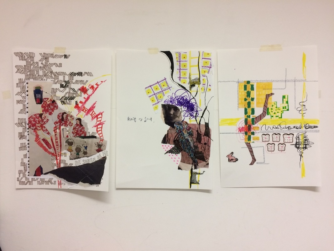 The 3 collages can be seen as a part of one series. I love how they look together. Although I really enjoyed our collaborative exercise, we still found it challenging to find a voice. It's like we were all trying to say something but we didn't know what we wanted to say. We really enjoyed working together in the studio! Week 15 (February 6th - 12th)We still didn't know what kind of sticker we wanted to create. We decided to set up a couple of creative exercises to help us find a creative flow. We decided to print out multiple copies of our own works and exchange our material with one another to take home. We hoped that it would lead us to create some interesting collages. I decided to continue with the illustrations and create a new series of work. The illustrations below are ones I chose to print out to pass out as material. I printed out several copies of the same images and even created different sizes.  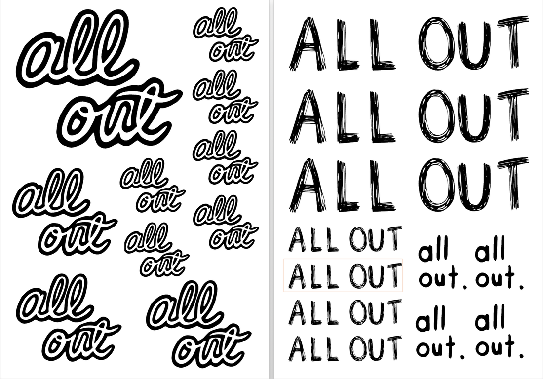  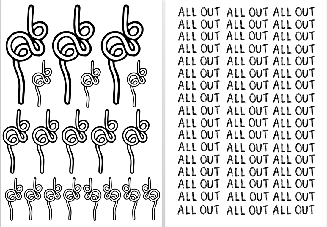 After exchanging material, we went our separate ways to create our own collages. This is what I was able to come up with...      Overall, I think we played off of each other's material very well. I allow me to push out of my comfort zone, especially because I wasn't all to familiar with collage. I was initially overwhelmed and I don't think collage is something I am particularly good at. Despite that, it was a very good exercise.
Andrei contributed a lot of grid patterns that was good for creating background and textures. HyeYeon printed out her favourite collages that she had created over the years. That was interesting because she used found magazine and newspaper material to create her own collages and we used her collages as a form of 'found' material. The recycling of its content and context was really interesting to observe. Week 15 (February 6th - 12th)After creating our individual collage studies, we regrouped to share our process, thoughts and final works. The following is a select few pictures of HyeYeon and Andrei's studies. HyeYeon's     Andrei's   Week 14 (January 30th - February 5th)At this point of the project, we knew each others practices, interests and our underlining connections. We also knew that we still wanted to create stickers. The only thing is...where? We were sure that we wanted to stick to public spaces around London, but that was a far too broad of a location. To get inspired we decided to take a little stroll - a field trip as you will - around Pimlico, near campus. The following slideshow depict some interesting spaces we were drawn to. We decided to record some of these places to spark some inspiration. Week 13 (January 19th-23rd)I've also been noticing connections between Andrei and I. Initially, thought we had very different approaches and styles but we both love symmetry, patterns, and repetition. I took a break from the illustrations last year (2016) to explore my obsession with collecting found objects. I found a way to connect this to my practice in the 'Uncreative practice: copying and appropriating' workshop last semester. I started displaying these found objects in the same sketchbook as my illustrations because I loved that found that the square sketchbook best framed my collection of 'junk'.   I find that I like repetition or replicas of the same object, mostly in pairs. In some ways it can be seen as something romantic, but to me, it's just wholistic and complete. I feel that it's the reason why I love squares and circles quite often and I found that I don't like any sense of imbalance. I'm also interested in the collage thinking - taking words out of its original context and into my own. I started to pay attention to words on packaging.   Most of the 'archive' is composed in a minimalistic and structured way, which is similar to Andrei's style. Consistency, patterns, structure, repetition and a minimalistic monochromatic approach is something that overlaps in our practice.  The above is showcases one of my favourite found material pairings. They are two unrelated cards. The one on the left was one I picked up at the age of 9 when I first moved to San Diego. The other one on the right was one I picked up in Singapore just in the last couple of years. The two different cards create a new narrative, one that the viewer decides. They do look aesthetically pleasing together, in a very archival and minimalistic way.  The picture above is an illustration I draw on top of a found cardboard object. It gives the phrase 'dig in' a new meaning. The phrase was originally a company name and logo for healthy snack delivery but was instantly turned into a sexual phrase. The composition created in my sketchbook can at times resemble a window or a display and takes form of a grid. The idea of 'the grid' is also a big influence on his work.    Some of the found material inspired new illustrations for me, in ways that I was appropriating and referencing iconic products and designs such as the Sun Maid raisins.
|
