Week 15 (February 6th - 12th)Solo collaboration in the studioWe decided find new and different ways of 'collaborating'. The first collaborative exercise allowed us to work independently but using each others material. This time we decided to do the same thing, only this time, we decided to work within the same space. What better place to do it than our own studio in A223! We all decided to collect more material and bring them to the studio. We also brought any tools or other material that might enhance our work (such as oil pastels, indian ink, construction tape and lino sheets and knives). The following slideshow is the result of this exercise. The captions under the images indicate who created them. Full-on collaboration in the studioWorking in the studio was very different from working independently at home. There was so much energy it felt like there was less pressure to create anything good. It was light-hearted and fun, which encouraged me to take risks and feel more free. For the third exercise, we decided to do a 'true' collaboration, where we all started with an A3 size paper and worked on it for a few minutes (approx. 10 minutes). After the 10 minutes (or if we feel like we were done working on it) we would exchange the A3 paper with someone else. It allowed each of us to work on each collage within the same space and even work upon each other's creation. This was definitely my favourite exercise! In all we created three A3 size collages as a result: 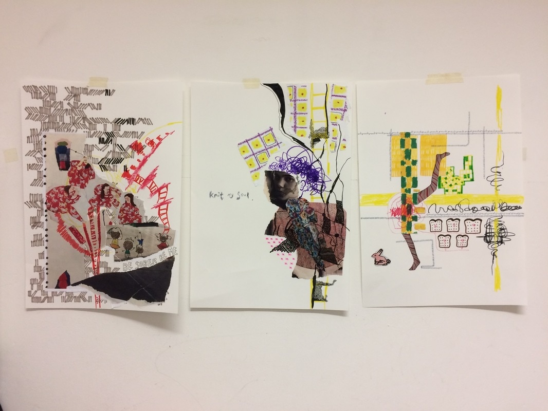 The 3 collages can be seen as a part of one series. I love how they look together. Although I really enjoyed our collaborative exercise, we still found it challenging to find a voice. It's like we were all trying to say something but we didn't know what we wanted to say. We really enjoyed working together in the studio!
0 Comments
Week 15 (February 6th - 12th)We still didn't know what kind of sticker we wanted to create. We decided to set up a couple of creative exercises to help us find a creative flow. We decided to print out multiple copies of our own works and exchange our material with one another to take home. We hoped that it would lead us to create some interesting collages. I decided to continue with the illustrations and create a new series of work. The illustrations below are ones I chose to print out to pass out as material. I printed out several copies of the same images and even created different sizes.     After exchanging material, we went our separate ways to create our own collages. This is what I was able to come up with...      Overall, I think we played off of each other's material very well. I allow me to push out of my comfort zone, especially because I wasn't all to familiar with collage. I was initially overwhelmed and I don't think collage is something I am particularly good at. Despite that, it was a very good exercise.
Andrei contributed a lot of grid patterns that was good for creating background and textures. HyeYeon printed out her favourite collages that she had created over the years. That was interesting because she used found magazine and newspaper material to create her own collages and we used her collages as a form of 'found' material. The recycling of its content and context was really interesting to observe. Week 15 (February 6th - 12th)After creating our individual collage studies, we regrouped to share our process, thoughts and final works. The following is a select few pictures of HyeYeon and Andrei's studies. HyeYeon's     Andrei's   Week 14 (January 30th - February 5th)At this point of the project, we knew each others practices, interests and our underlining connections. We also knew that we still wanted to create stickers. The only thing is...where? We were sure that we wanted to stick to public spaces around London, but that was a far too broad of a location. To get inspired we decided to take a little stroll - a field trip as you will - around Pimlico, near campus. The following slideshow depict some interesting spaces we were drawn to. We decided to record some of these places to spark some inspiration. Week 13 (January 19th-23rd)I've also been noticing connections between Andrei and I. Initially, thought we had very different approaches and styles but we both love symmetry, patterns, and repetition. I took a break from the illustrations last year (2016) to explore my obsession with collecting found objects. I found a way to connect this to my practice in the 'Uncreative practice: copying and appropriating' workshop last semester. I started displaying these found objects in the same sketchbook as my illustrations because I loved that found that the square sketchbook best framed my collection of 'junk'.   I find that I like repetition or replicas of the same object, mostly in pairs. In some ways it can be seen as something romantic, but to me, it's just wholistic and complete. I feel that it's the reason why I love squares and circles quite often and I found that I don't like any sense of imbalance. I'm also interested in the collage thinking - taking words out of its original context and into my own. I started to pay attention to words on packaging.   Most of the 'archive' is composed in a minimalistic and structured way, which is similar to Andrei's style. Consistency, patterns, structure, repetition and a minimalistic monochromatic approach is something that overlaps in our practice.  The above is showcases one of my favourite found material pairings. They are two unrelated cards. The one on the left was one I picked up at the age of 9 when I first moved to San Diego. The other one on the right was one I picked up in Singapore just in the last couple of years. The two different cards create a new narrative, one that the viewer decides. They do look aesthetically pleasing together, in a very archival and minimalistic way.  The picture above is an illustration I draw on top of a found cardboard object. It gives the phrase 'dig in' a new meaning. The phrase was originally a company name and logo for healthy snack delivery but was instantly turned into a sexual phrase. The composition created in my sketchbook can at times resemble a window or a display and takes form of a grid. The idea of 'the grid' is also a big influence on his work.    Some of the found material inspired new illustrations for me, in ways that I was appropriating and referencing iconic products and designs such as the Sun Maid raisins.
Week 13 (January 19th-23rd)The little sharing circle was really helpful. Not only did I start to develop a better understanding of my own practice, I became slightly more confident with my illustrations. It was so interesting to note that we all had really different approaches and interest but we still shared similarities. I first noticed this with HyeYeon's collection of collages. Her soft, emotional and romantic collages reminded me of some of my own collages I did back in 2015, when I was digging through magazines for inspiration. She likes using landscapes but I feel that she gravitated towards people and the body (particularly women), which was similar to my case. 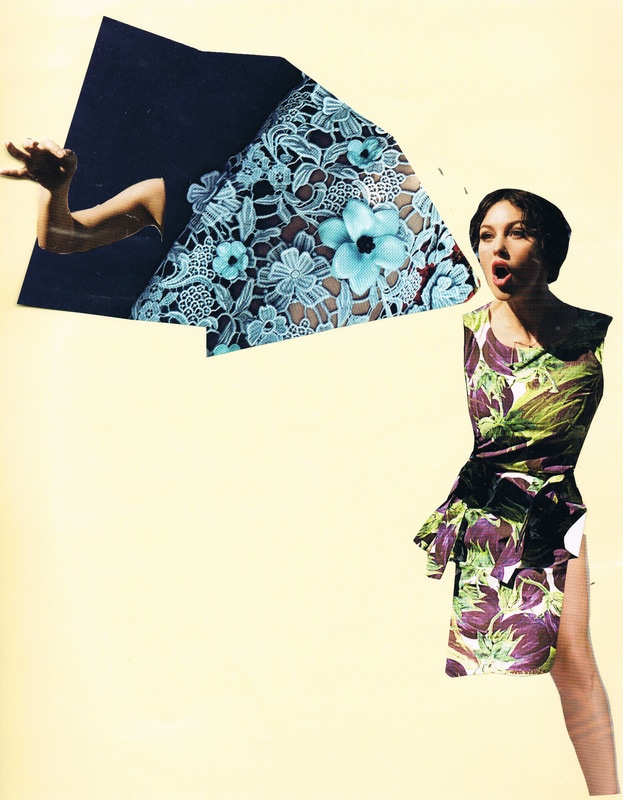 Calling (2015), magazine collage I used these collages as more of a free exercise to develop my composition skills. Drawing is more of my strong suit, so I attempted to incorporate pen drawings into the collages. I was also developing a taste for thick black borders, which carried on into the editing stages of my sketches. 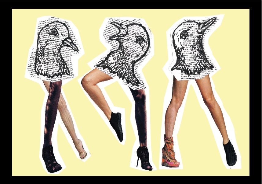 Pigeon Heads (2015), pen and magazine collage I went back to doing more pen and paper works, trying to incorporate what I learned from my collage exercises. Instead I started experimenting with incorporating found materials in my sketches. In Pots and Pandas (2015), I incorporated a haw flakes wrapper, made in china. Looking back, I realise how strong cultural weight the wrapper has and how that can really give the work more character. 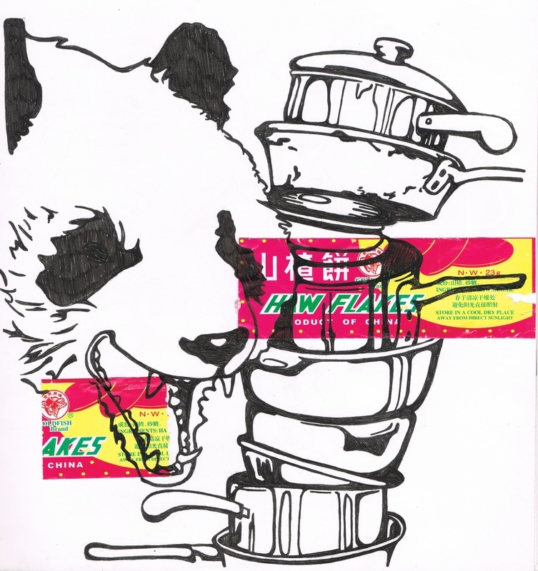 I started implementing the collage-like compositions into solely pen and paper illustrations. I was inspired by the way women and their bodies were depicted in media such as magazines, comic books and video games (particularly Grand Theft Auto posters and covers). I wanted to experiment with patterns, textures, use of borders and how to bring an image to life by using imagery that alludes to sound, taste and smell. It is one of my favourite illustrations I've done. 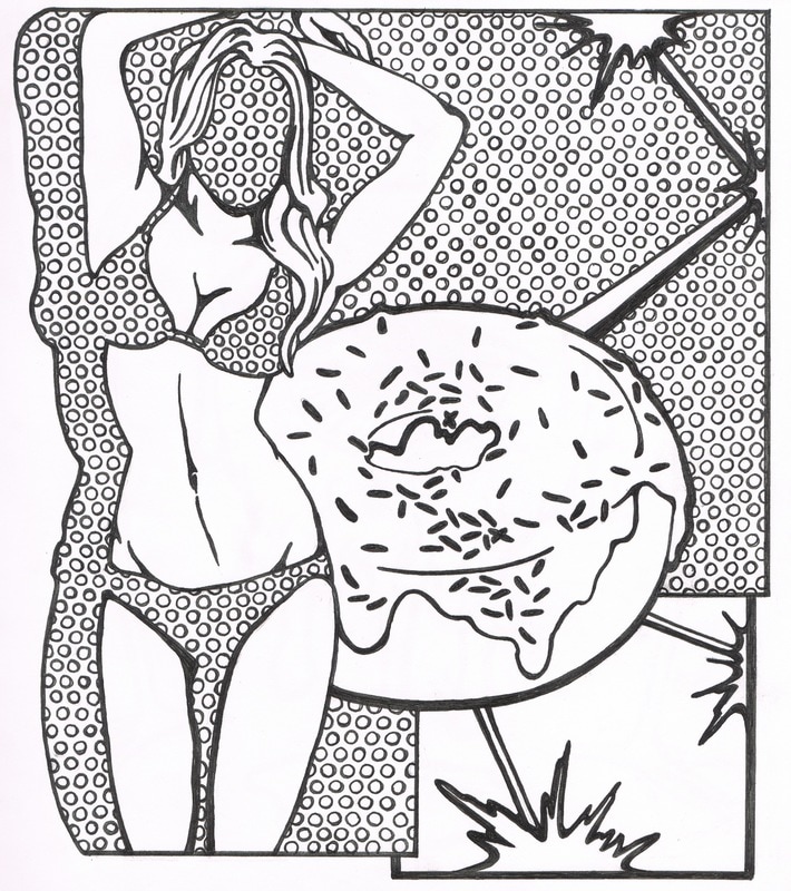 Doughnuts & Lasers (2015) Unedited, pen on paper I tried this with different objects and things that came to mind. Most of these objects are meant to seem unrelated but somehow create an interesting story. In my head, these things do relate to each other and I think its a fun idea to think that other people can create their own logic when looking at the objects interacting together. Unlike Doughnuts & Lasers (2015), I created a less angular, more organic border, where all the items overlap and interact with each other becoming one flat 'piece'. I definitely think HyeYeon and I have a connection here when we talk about collage and pairings of different objects. We both like creating a story with the compositions of what already exists.  Week 13 (January 23rd-29th)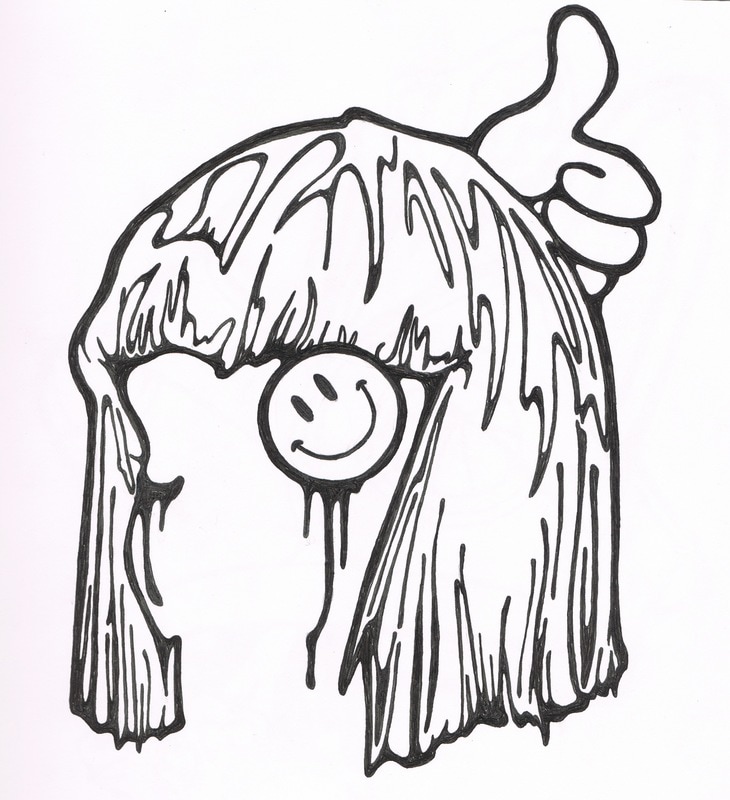 Good n' Happy (2015) Unedited sketch, pen on paper Good n' Happy (2015) Unedited sketch, pen on paper Working with a group is HARD. Especially when working with other artists with very different and distinct styles and practices. We decided to present out works to each other first, to get a better understanding of what territories of practice we are working with and to see if there is any form of chemistry between us. We all however, came in knowing we wanted to work around the idea of stickers. My practice is very varied and I am interested in exploring different forms of media to portray my ideas. I decided to build upon my some of my illustrations I've been working on along side my fine art practice. I always felt that my illustration practice can't be or wasn't supposed to be connected to my fine art practice but I finally asked myself, "Why not? Why can't illustration be a part of my fine art practice?". I didn't know what the final stickers would look like, nor did I know how it was going to be influenced by the other members of the group. However, we had a couple of goals in mind: - the final project is a series of stickers - it will be a 'true' collaborative project, having our styles and practices influence and inspire our own - the stickers will be showcased in public areas around London - the tone of the work is to be fun and light-hearted - interactive: engaging with the public audience  3 Heads (2015) Unedited, pen on paper 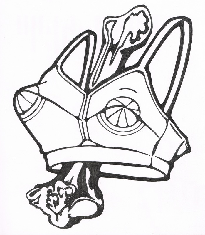 Bone Thin (2015) Unedited, pen on paper 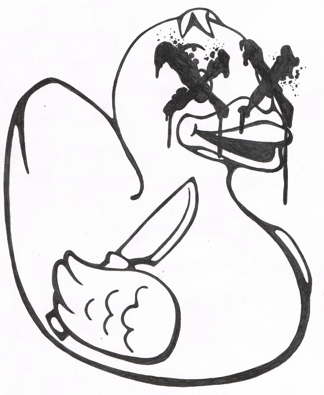 Ducky (2015) unedited, pen on paper These illustrations are all done in a regular black 0.7 ball point pen. They are all from my illustration sketchbook and are therefore unedited. The final images are touched up with Adobe Illustrator. I love bold black lines and how it has the 'colour book' feeling. I like taking two or more images that are fairly mundane on its own, but create an interesting juxtaposition when paired together. I also found that I like squares (symmetry and repetition) in both my illustration and fine art practice and I decided that I would use it to my advantage. I like that it tries to command the viewer's attention, almost like its trying to say something, but there is no real clear message. It's bold and a little loud but gives the viewer more freedom to interpret the work. The illustrations naturally have a 'sticker-like' quality to them, and I decided that the only way to progress with this collaboration was to keep on drawing. 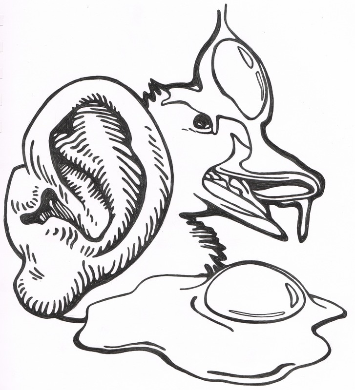 Eggy (2015) Unedited, pen on paper #sticky is a sticker collaboration I did with my friends Andrei Gloria and HyeYeon Im to explore the dissemination and consumption of information in public spaces. Each artist created a unique series of stickers with their own take on #sticky and stuck them around London. With the internet also being a public space, #sticky went online on Facebook, where it not only contains photographic documentation of the stickers but people's responses to #sticky. This was a project created in Chelsea College of Art and Design (University of the Arts London) BA(Hons) Fine Art Year 2 with the aim of creating a collaborative off-site exhibition. This blog follows through the process of creating the final stickers and all my thoughts, inspirations, reflections and failures that came with it.
|
